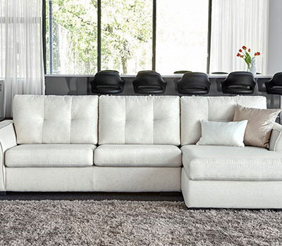
A white sofa is the most versatile piece of furniture you can own. It also happens to be the one that stumps most people when it’s time to pick pillows, throws, and wall colors. The problem isn’t a lack of options — it’s too many. Walk into any home store and you’ll see 47 shades of blue alone. Which one won’t make your room look like a dentist’s waiting room?
Here’s the short answer: white sofas work best with accent colors that have high contrast and low saturation. Think deep navy, not pastel baby blue. Think rust and terracotta, not bright orange. This guide gives you seven specific color palettes that professional designers use, with exact paint names, fabric codes, and real-world examples so you can copy them exactly.
Why Most White Sofa Rooms Look Flat (And How to Fix It)
The number one mistake is playing it too safe. People buy a white sofa, then add beige walls, a cream rug, and oatmeal curtains. The result is a room that feels unfinished — like a rental staged for photos, not a home someone actually lives in.
White needs contrast to feel intentional. Without it, the sofa just looks like a big blank spot. The fix is simple: pick one element — wall color, rug, or artwork — that creates a visual anchor. That anchor gives the white sofa a job: to reflect light and let that anchor color shine.
The 60-30-10 Rule Applied to White Sofas
Interior designers use this ratio for a reason. With a white sofa, your formula is:
- 60% dominant color: white (your sofa, maybe your walls)
- 30% secondary color: your main accent — this goes on walls or a large rug
- 10% pop color: pillows, art, a single chair
The mistake people make is using the 10% pop color as their only accent. One bright yellow pillow on a white sofa isn’t a color scheme — it’s a lonely pillow. You need the 30% layer to make it work.
What About the White Itself?
Not all white sofas are the same white. The IKEA Kivik in “blekinge white” is a warm cream. The Article Sven in “cream” is slightly gray. The Room & Board Metro in “white” is a true bright white. Match your accent colors to the undertone of your sofa. Warm white sofas pair with earthy accents (terracotta, olive, camel). Cool white sofas pair with jewel tones (sapphire, emerald, charcoal).
7 Proven Color Palettes for White Sofas
Each palette below includes the exact paint color name (with brand), the type of accent pieces to buy, and why it works. No vague “add some blue” advice — you’ll know exactly what to order.
| Palette Name | Wall Color | Accent Colors | Best For | Difficulty |
|---|---|---|---|---|
| Navy & Camel | Sherwin-Williams Naval (SW 6244) | Camel leather, brass, cream | Traditional, coastal | Easy |
| Forest & Terracotta | Farrow & Ball Studio Green No. 93 | Rust, ochre, natural wood | Bohemian, eclectic | Medium |
| Charcoal & Blush | Benjamin Moore Graphite (2125-30) | Dusty pink, taupe, black | Modern, minimalist | Easy |
| Olive & Mustard | Behr Olive Grove (PPU5-10) | Golden yellow, tan, brown | Mid-century, warm | Medium |
| Navy & Coral | Benjamin Moore Hale Navy (HC-154) | Salmon, white, gold | Coastal, tropical | Easy |
| Slate & Sage | Sherwin-Williams Urbane Bronze (SW 7048) | Sage green, lavender, gray | Scandi, calm | Easy |
| Burgundy & Ivory | Farrow & Ball Brinjal No. 222 | Cream, gold, dark wood | Victorian, dramatic | Hard |
Palette 1: Navy and Camel
This is the safest bet that still looks designed. Navy walls (Sherwin-Williams Naval or Benjamin Moore Hale Navy) create a deep backdrop that makes the white sofa glow. Add a camel-colored leather ottoman — the Article Sven Charme Cognac Leather Ottoman ($449) works perfectly — and brass floor lamps. The contrast between the warm camel and cool navy keeps the room from feeling like a ship’s cabin.
Palette 2: Forest and Terracotta
For boho lovers. Paint one accent wall Farrow & Ball Studio Green — it’s dark enough to read as almost black in low light, but green in full sun. Layer terracotta pillows (West Elm’s terracotta linen pillow covers, $39 each) and a chunky cream knit throw. Add a jute rug for texture. The white sofa sits in the middle like a cloud between earth and forest.
Palette 3: Charcoal and Blush
For modern apartments. Paint walls Benjamin Moore Graphite — a deep, warm charcoal. Add blush pink pillows in velvet (Etsy sellers sell custom sizes for around $25) and a black metal coffee table. The white sofa becomes the light source in the room. This palette works especially well in north-facing rooms that get cool gray light.
The Best Rug Colors Under a White Sofa
Your rug is the single most impactful accent you’ll choose. It covers more visual space than any pillow or art piece. Get this wrong and nothing else matters.
Three rug colors that work every time:
- Navy blue: A deep navy wool rug (like the Safavieh Vintage Collection in navy, 8×10 for $280) anchors the sofa and hides spills better than any other color.
- Natural jute/sisal: Adds texture without competing. A 8×10 jute rug from World Market costs $150 and makes the white sofa feel beachy and casual.
- Graphite gray: For modern spaces. A low-pile graphite rug (like the nuLOOM Rigo in charcoal, 8×10 for $160) keeps the room sleek and lets colorful pillows pop.
One rug color to avoid: Beige. A beige rug next to a white sofa creates a muddy, undefined look. It reads as “off-white” and makes the whole room feel washed out. If you want neutral, go darker — charcoal, navy, or even black.
Rug Size Matters More Than Color
A common mistake is buying a rug that’s too small. For a standard 84-inch sofa, you need at least an 8×10 rug. The front legs of the sofa should sit on the rug — not the whole sofa, but at least the front edge. A rug that floats in the middle of the room with the sofa’s legs off it makes the space feel chopped up. Rule of thumb: the rug should extend 18-24 inches past each side of the sofa.
Pillow and Throw Strategies That Don’t Look Cluttered
Here’s where most people go wrong: they buy four matching pillows from a set and line them up like soldiers. That’s not decorating — that’s merchandising. A lived-in sofa has pillows that look collected, not purchased as a set.
The 3-Pillow Formula
Use exactly three pillows on a standard 84-inch sofa. Any more and you’ll be moving them to the floor every time you sit down. The formula:
- One large square (22×22): In your main accent color. Example: a navy velvet pillow.
- One lumbar (12×20): In a contrasting texture. Example: a cream cable-knit lumbar.
- One small square (18×18): In your pop color. Example: a rust-colored linen pillow.
Mix fabrics — velvet, linen, knit, and cotton all on the same sofa. The texture variety is what makes it look intentional rather than store-bought.
Throw Blankets: One, Not Two
A single throw draped over one arm of the sofa is enough. Two throws look like you’re preparing for a power outage. Choose a chunky knit in cream or oatmeal — the ChappyWrap brand ($89) makes a good one. Drape it loosely, not folded perfectly. The point is to look casual.
Wall Art and Decor That Complements, Not Competes
The white sofa is a neutral background for your art. Don’t hang art that’s the same size as the sofa — it will look like a postage stamp on an envelope. Art should be at least two-thirds the width of the sofa. For a 84-inch sofa, that means a 56-inch wide piece, or a gallery wall that spans that width.
Frame Colors Matter
Black frames read modern and graphic. Gold frames read warm and traditional. Natural wood frames read boho. Pick one frame color and stick with it across all your pieces. Mixing gold and black frames on the same wall looks like a flea market exploded.
What to Hang Behind a White Sofa
- A large abstract painting in your accent colors. A 48×36 canvas in navy and rust tones ties the whole room together.
- A round mirror. The curve breaks up all the rectangular shapes (sofa, coffee table, rug). A 36-inch round mirror from IKEA ($79) works great.
- A macrame wall hanging in cream or natural cotton. Adds texture without color competition.
What Not to Do: 3 White Sofa Mistakes
These are the errors I see most often in reader photos and design forums. Avoid them and your room will look 10x better immediately.
Mistake 1: Matching Everything
White sofa, white walls, white rug, white curtains. This isn’t minimalist — it’s a hospital waiting room. You need at least one dark element (wall, rug, or large furniture piece) to give the white sofa context.
Mistake 2: Using Only Small Accents
One blue pillow and a blue candle on the coffee table is not a color scheme. It’s a whisper. Your accent color needs to appear in at least three places in the room, and at least one of those should be a large surface area like a rug or wall.
Mistake 3: Forgetting About Lighting
A white sofa in a room with only overhead lighting looks flat and cold. You need warm light sources — floor lamps with 2700K bulbs, table lamps with linen shades. The warm light brings out the creaminess in white upholstery and makes the room feel cozy rather than sterile.
The One Palette You Should Try First
If you’re stuck and just want a room that works today, start with the Navy and Camel palette. Paint one wall Sherwin-Williams Naval (it’s dark enough to feel dramatic but reads as neutral), buy a camel leather ottoman or a pair of camel-colored armchairs, and add brass lamps. The white sofa will look crisp and intentional. It’s the palette that professional stagers use most often for a reason: it works in every room, every light, and every style.