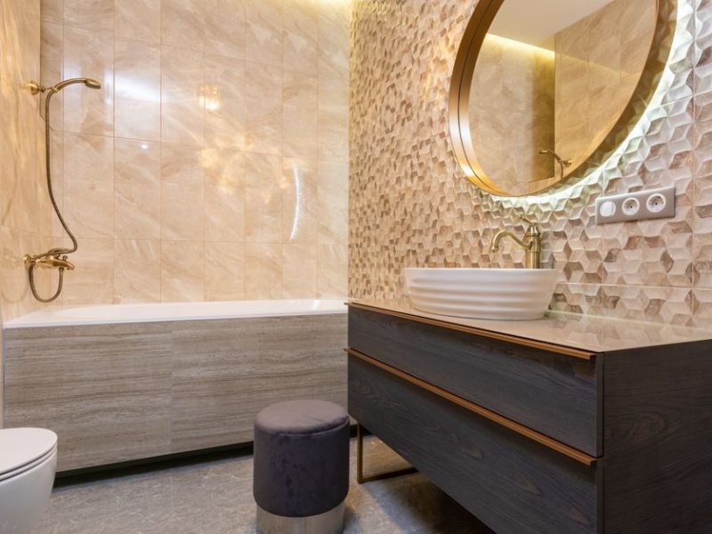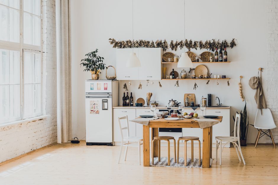
Your dining table is warm honey oak, the floor is pale ash, and the bookcase you inherited is a deep reddish brown. None of the pieces look wrong alone. Together, though, the room feels like several homes were pushed into one space. That reaction usually comes from competing undertones and scattered visual weight, not from the number of wood finishes.
Mixing wood tones works when the room has a clear hierarchy: one finish leads, a second supports it, and a third appears in small repeated details. You do not need every piece to match. You need the finishes to look related, spaced with intention, and balanced by fabric, paint, metal, or stone.
Why mixed wood looks chaotic in the first place
Wood tone has three separate qualities
People often call a wood finish light, medium, or dark, but that describes only one quality: value. The other two are undertone and grain movement. Value tells you how much visual weight a piece carries. Undertone tells you if the brown leans yellow, orange, red, gray, or green. Grain movement tells you how loudly the surface speaks.
A pale oak floor with a yellow undertone can sit comfortably beside a medium walnut cabinet because the contrast feels deliberate. A pale oak floor beside a red mahogany table may feel accidental, even though both pieces are medium-brown. The problem is not that the woods differ. The problem is that the eye reads two unrelated color temperatures competing for attention.
Rooms need a visual anchor
Most successful rooms have one wood finish that occupies the largest area or carries the strongest shape. In a dining room, that anchor might be the floor or table. In a bedroom, it might be the bed frame. Once that anchor exists, smaller pieces should either echo it or provide a controlled contrast.
Chaotic rooms usually spread strong finishes evenly across the space: a dark console on one wall, a red-toned chair in the corner, a yellow oak table in the center, and a black-brown lamp base between them. Each object asks to be noticed. The fix starts with deciding which finish should dominate, then reducing the number of isolated accents.
Choose a wood palette before buying another piece
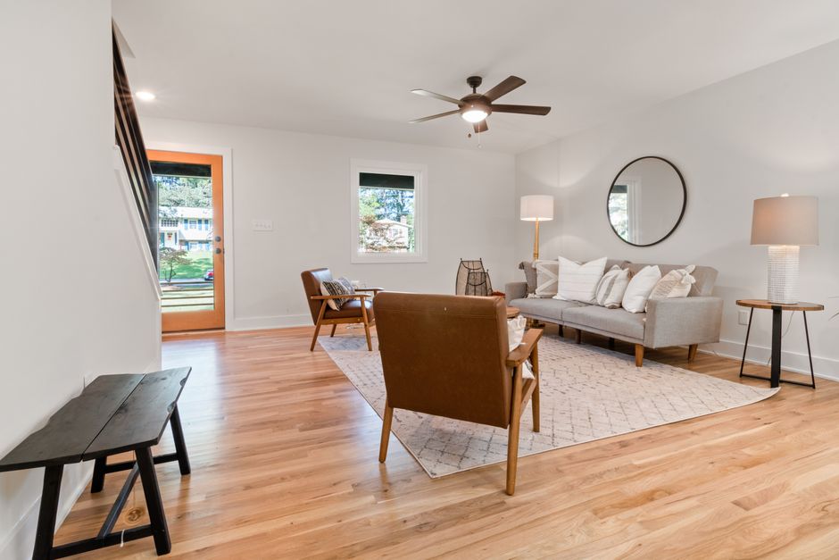
Start with the largest fixed surface
Photograph the floor, built-ins, doors, or kitchen cabinets in daylight, then identify their undertone before shopping. If the floor is pinkish walnut, do not bring home a yellow pine table because the sample looked attractive under a store’s warm lighting. If the cabinets are neutral oak, a dark walnut accent can add depth without forcing an exact match.
Use one related tone and one deliberate contrast
The safest palette contains one dominant tone, one close relative, and one contrasting tone used sparingly. For example, pale ash can lead, natural oak can repeat through a frame or shelf, and dark walnut can appear in one coffee table plus two small accessories. That four-sentence rule gives the room variety without turning every corner into a separate color story. The best choice is to repeat the contrast at least twice, because a single dark object often looks misplaced while two or three create a pattern.
Use undertone and value, not wood species alone
Names such as oak, ash, maple, walnut, and mahogany help, but species alone cannot predict how a finished piece will look. Stain, clear coat, age, lighting, and grain direction can push the same species into very different visual territory. Judge the actual finish in the room instead of trusting the label.
A practical comparison for common room palettes
| Wood family | Visual value | Common undertone | Best supporting tones | Main risk |
|---|---|---|---|---|
| Pale ash or bleached oak | Light | Neutral to yellow | Natural oak, soft walnut, linen, black metal | Too many pale finishes can make the room feel flat |
| Natural oak or maple | Light to medium | Yellow to neutral | Ash, medium walnut, clay, olive, cream | Orange stains can look dated beside cool gray |
| Teak or honey wood | Medium | Golden to orange | Dark walnut, ivory, charcoal, woven fibers | Several orange woods can make the room look overly warm |
| Walnut or espresso | Medium to dark | Brown to purple-gray | Oak, ash, brass, white, muted green | Too much dark wood can shrink a small room visually |
| Mahogany or cherry | Medium to dark | Red to copper | Neutral oak, cream, olive, aged brass | Red and orange finishes can fight when placed side by side |
The strongest pairing usually creates both contrast and a bridge. Dark walnut next to pale ash needs a middle tone, such as natural oak, woven cane, tan leather, or a beige rug. That middle value stops the two extremes from colliding. If your room already contains three undertones, add a large neutral textile before adding another wood object.
Arrange three wood tones with a repeatable method
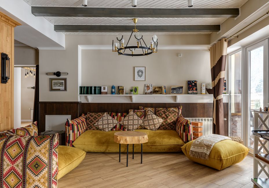
When you already own mismatched furniture, do not start by replacing the most expensive piece. Reorder the room first. Distance, repetition, and surrounding color can change how finishes relate.
- Photograph every wood surface. Include the floor, doors, furniture, frames, lamps, and visible shelves. Put the photos in one grid so you can see repeated colors instead of judging each piece in isolation.
- Choose the anchor. Give the largest fixed or most important item the lead role. If the floor covers the whole room, it usually becomes the anchor. If the floor is pale and quiet, a substantial walnut table can take over.
- Group similar tones. Place two warm pieces near each other instead of sending one to each corner. A walnut cabinet beside a walnut-framed mirror reads as a planned zone. The same cabinet alone across from a reddish chair feels random.
- Repeat the strongest contrast. If one dark piece is necessary, repeat its value in a smaller object, such as a black-brown frame, lamp base, or chair leg. The repetition can be subtle; it does not need to be another large table.
- Break up long wood runs. A wood floor beside wood cabinets beside a wood island needs a visual pause. Use a runner, painted stool, upholstered chair, metal hardware, or stone tray between the surfaces.
- Test samples at three times of day. Place finish samples near a window, in the room center, and beside the dominant furniture. Check them in morning, afternoon, and evening light before ordering. Warm bulbs can make neutral oak look yellow and walnut look red.
For a budget-friendly example, the IKEA LISABO table in ash veneer is listed at about $299.99 and measures roughly 55 1/8 by 30 3/4 inches. It works best as a light anchor in a room with darker accents, not as another pale wood piece surrounded by several similar blond finishes. The IKEA MÖRBYLÅNGA oak-veneer table, about $899.99 at 86 5/8 by 39 3/8 inches, makes a stronger statement and needs more visual breathing room.
Common questions about mixing wood tones
Can I mix warm and cool wood in one room?
Yes, but give one temperature the larger share. Warm oak with cool gray-washed wood can work when cream, black, or natural linen repeats between them. The contrast looks intentional when the cooler finish appears in more than one place. If the cool piece is a lone gray cabinet beside several orange woods, it will look detached.
How many wood tones are too many?
Three major tones are usually enough for a medium-sized room. A fourth can work when one finish appears only in small details, such as a frame or stool. Count visual impact rather than objects: five small walnut accents may read as one repeated tone, while three large tables in different finishes may overwhelm the space.
Which products show the difference in scale and contrast?
The West Elm Calla Solid Wood Side Table is an 18-inch accent piece listed around $399, so it can repeat a dark walnut or natural finish without taking over. The Pottery Barn Oakleigh Square Side Table is 24 inches and listed around $649; its larger footprint needs a stronger relationship with the coffee table or floor. For a clear verdict, choose the West Elm piece when you need a small repeated accent, and choose the Pottery Barn piece only when the room has enough space to support another substantial wood shape.
Should I paint a wood piece that clashes?
Paint is the right move when the furniture has good proportions but an undertone that cannot work with the room. It is the wrong move for valuable solid wood, well-made veneer, or a piece whose grain is the main reason you like it. Try relocating and bridging first; paint becomes the final tool, not the first reaction.
The single most important takeaway is to repeat one wood tone, contrast it with another, and use neutral materials to connect the two.