How to choose a spring palette that lasts beyond April
The best spring palette is not the palest one. It is the one that still looks useful after the flowers fade and the weather turns warmer. Choose colors from the room’s permanent features first: flooring, sofa fabric, curtains, wood tone, and wall paint. Spring accents should respond to those colors rather than compete with them.
Use the 60-30-10 split
Keep roughly 60 percent of the room in its base color, such as cream, gray, tan, white, or warm wood. Let 30 percent come from a secondary color already present in the room. Reserve 10 percent for the spring accent. In a living room with a gray sofa and oak floor, the 30 percent layer could be soft green in a rug or curtains, while the 10 percent layer could be coral cushions and a yellow ceramic bowl.
This ratio is a guide, not a measuring exercise. Its value is restraint. Bright color has more impact when it occupies a small, clear area.
Test color in morning and evening light
Put fabric samples on the sofa, beside the window, and under the room’s lamps. Pink can look peach in warm artificial light. Green can look gray beside north-facing daylight. Take a phone photo at 9 a.m., 2 p.m., and 8 p.m. before buying multiples.
Choose colors that survive all three checks. The strongest spring palette for a busy family room is usually one muted color plus one brighter accent, not several equally loud shades. Save high-contrast combinations for removable pieces such as cushion covers and tabletop accessories.
How to layer spring textiles without making the room look themed
My recommendation: change texture before adding more color. A room feels fresh when the hand and surface of the materials change, not only their hue. Pair one smooth textile with one nubby or washed textile, then add a small patterned item. This creates depth while keeping the palette under control.
Start with the largest practical textile
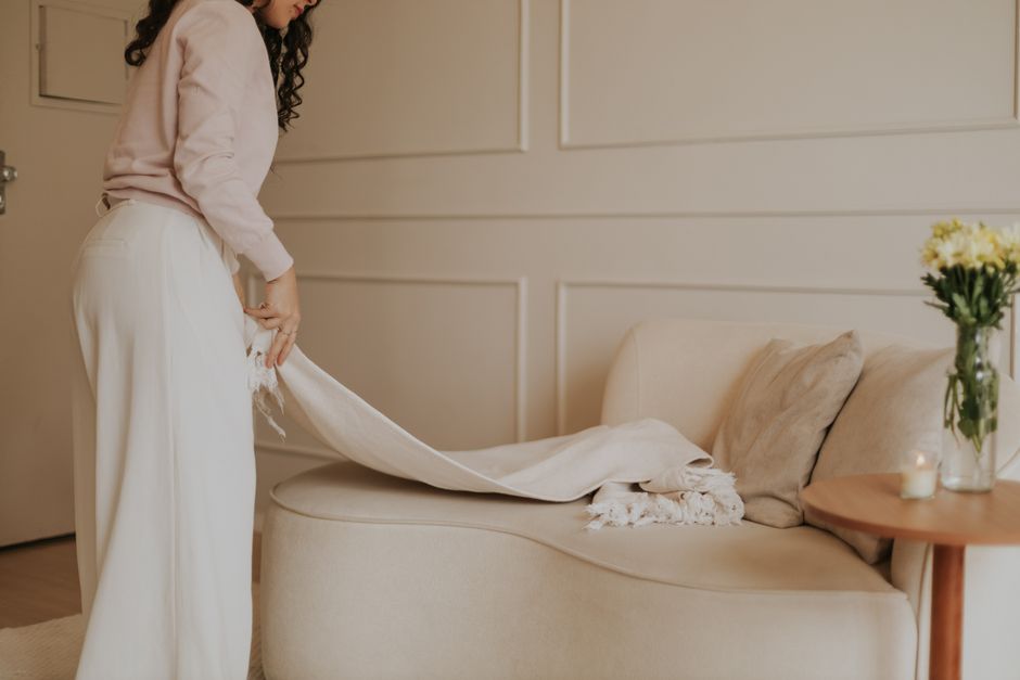
Begin with one throw, runner, or pair of curtains. A single large layer sets the direction for everything else. For a sofa, a 50-by-60-inch throw folded over one arm has enough presence to be seen without covering the furniture. For a dining table, a 14-by-72-inch runner usually leaves visible table surface on both sides and works better than a full seasonal tablecloth.
Then add two or three cushion covers in different shapes. A 20-by-20-inch square cover gives structure. A 16-by-23-inch lumbar cover breaks up a row of identical squares. Keep one cushion neutral so the color feels edited rather than repeated.
Mix fabric behavior, not random patterns
The IKEA DYTÅG cushion cover costs about $19.99 for a 20-by-20-inch washed linen cover. Its relaxed texture suits a calm room with wood, rattan, or cotton. The IKEA VATTENVÄN cushion cover costs about $12.99 for a 20-by-20-inch pink-striped cotton and viscose design. It has more visual movement, so it works best beside solid covers rather than another large pattern.
For a low-cost color test, the H&M Cotton Canvas Cushion Cover is 20-by-20 inches, made from 100 percent cotton, and has been listed at about $4.49 on sale compared with a $7.99 regular price. It is the best first purchase when you want to test pink without committing to a full set. Buy one, live with it for a week, and only then decide if the color deserves a larger role.
Which spring textile should you buy first?
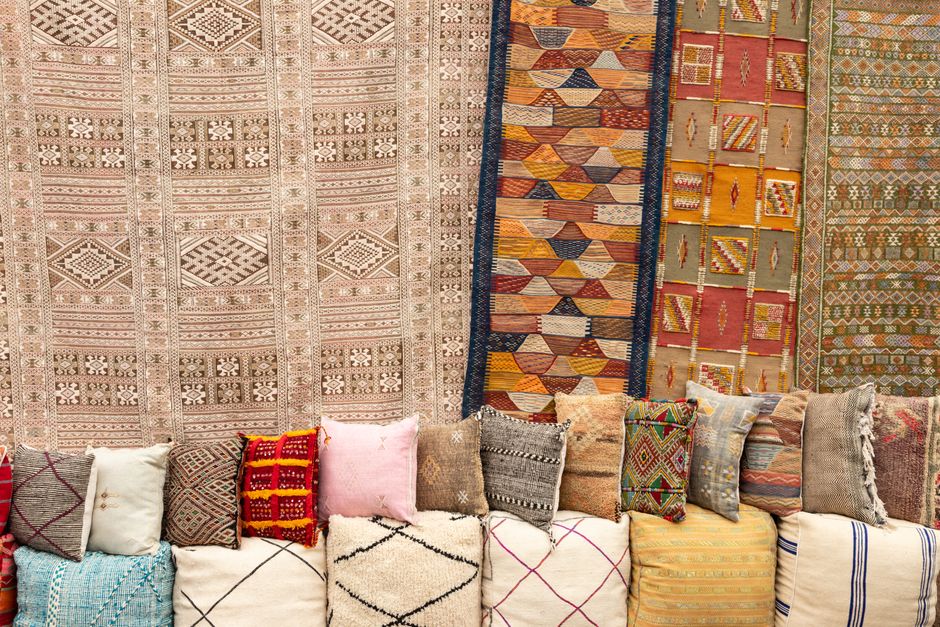
Buy the item that gives the widest color test for the lowest risk. Cushion covers usually win because they are small, washable, easy to store, and simple to move between rooms. A curtain or large rug can transform a space, but the wrong shade becomes an expensive correction.
Quick comparison for a first purchase
| Item | Approximate price | Size or material | Best use |
|---|---|---|---|
| H&M Cotton Canvas Cushion Cover | $4.49 sale, $7.99 regular | 20-by-20 inches, 100% cotton | Testing pink on a small budget |
| IKEA STRANDMALÖRT Cushion Cover | $7.99 | 20-by-20 inches, light pink | Soft color beside neutral upholstery |
| IKEA SANELA Cushion Cover | $9.99 | 20-by-20 inches, pale pink cotton velvet | Adding a richer surface to a plain sofa |
| IKEA VATTENVÄN Cushion Cover | $12.99 | 20-by-20 inches, pink stripe | Adding a brighter pattern |
| IKEA DYTÅG Cushion Cover | $19.99 | 20-by-20 inches, washed linen | Relaxed texture in a natural room |
My clear buying order
Choose one solid cover first, one textured cover second, and a pattern third. The IKEA STRANDMALÖRT is the safest low-cost starting point for a pale pink scheme. Choose the H&M canvas cover when price matters most. Choose the IKEA DYTÅG when texture matters more than a strong color statement. The IKEA VATTENVÄN is the final layer, not the foundation.
Prices can change with sales, stock, and location. Treat the table as a planning tool rather than a permanent price list. The decision still holds: test a small removable item before buying a large seasonal textile.
What goes wrong with spring color decorating?
Most failed seasonal updates do not fail because the colors are wrong. They fail because the buyer repeats one idea too many times or ignores how the room is used. The following questions expose the common traps before they become returns and storage problems.
Why does my room look childish after I add pink?
Pink becomes sugary when every surface is smooth, pale, and equally decorative. Add contrast with washed linen, natural wood, matte ceramic, or a deep neutral such as charcoal. The IKEA SANELA pale pink cotton velvet cover at about $9.99 can look grown-up beside oatmeal linen and dark wood, but several velvet pieces together may look overly polished.
Why do spring accessories look disconnected?
They probably repeat color without repeating context. A pink cushion beside a green plant and a yellow bowl can work because each color has a role. A pink cushion, pink vase, pink candle, and pink frame create a display with no visual rest. Remove one item and move another to a nearby room.
When should I skip a seasonal textile?
Skip it when the fabric is hard to wash, the color clashes with fixed pieces, or storage is already difficult. Avoid a large pale rug in a high-traffic entryway. Avoid delicate fringe in a home with pets that pull loose threads. In those cases, use a ceramic accessory, framed print, or replaceable cushion cover instead. Washability matters more than a perfect photograph.
When paint or art beats spring textiles
Textiles are the best tool for a temporary refresh, but they are not always the right answer. If the room lacks color because the walls feel flat, one framed print or a small painted section may give more impact than six cushions. If the room already has too many patterns, adding another textile makes the problem louder.
Choose paint for a fixed color problem
Use paint when you want a clear backdrop for several seasons and the wall is the main empty surface. A muted sage, dusty blue, or warm blush can support neutral furniture without requiring repeated accessories. Test a sample board at least 24 by 24 inches. Do not judge a color from a tiny painted patch beside a bright white wall.
Skip paint if you rent, expect to move soon, or are trying to solve a furniture layout problem. Color cannot fix a blocked walkway, poor lamp placement, or a sofa that is too large for the room.
Choose art or one accessory for a lower-commitment change
Art beats textiles when the room already has enough soft surfaces. A botanical print, yellow ceramic vessel, or pink glass lamp can bring spring color without adding more bulk. Keep the new item near a color already present in a rug, book spine, plant pot, or view outside the window.
For most homes, the strongest plan is one seasonal textile layer and one non-textile accent. That balance gives the room a visible update without creating a storage box full of forgotten decor. Spring home textiles will keep moving toward lighter fabrics, washable covers, and colors that can stay useful after the season changes.